Sperry Top-Sider
Retail Design / Illustration / Sales Collateral
with ZAC, llc
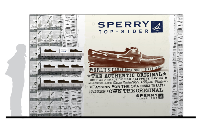
As a fashion mainstay of the Eighties, Sperry Top-sider experienced an opportunity few brands receive: a second chance. Determined to remain relevant, the shoe company took great measures to update their visual brand and continue to appeal to their ever-changing audience. ZAC, llc called LP/w to develop key retail touch points such as POP displays, shelf displays, and packaging.

Brand Guidelines


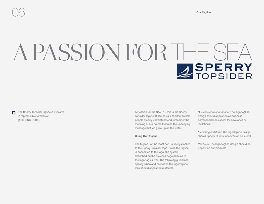


Brand Book


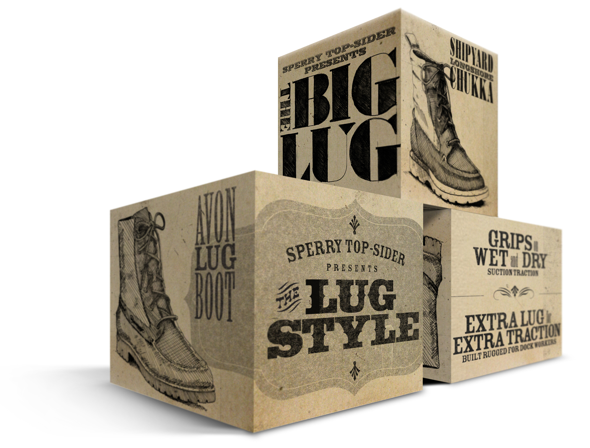
Product Launch - Design and Illustration


In-Store Displays


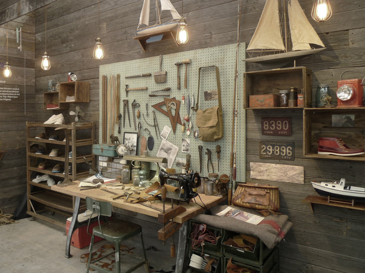
It's not often that a retailer offers a designer the opportunity to create a brand experience that's not crammed with products. But Sperry Top-Sider wanted to re-connect the audience with what makes their shoes so special - they're all still handmade. So as part of their "Made in Maine" series, LP/w crafted a unique display in the more-art-gallery-than-store, Fred Segal Conveyor, of how we'd imagine the look of Paul Sperry's original workshop.



Packaging Design


Copyright 2018
LP/ws Design Studios
All rights reserved.
All wrongs reversed.
